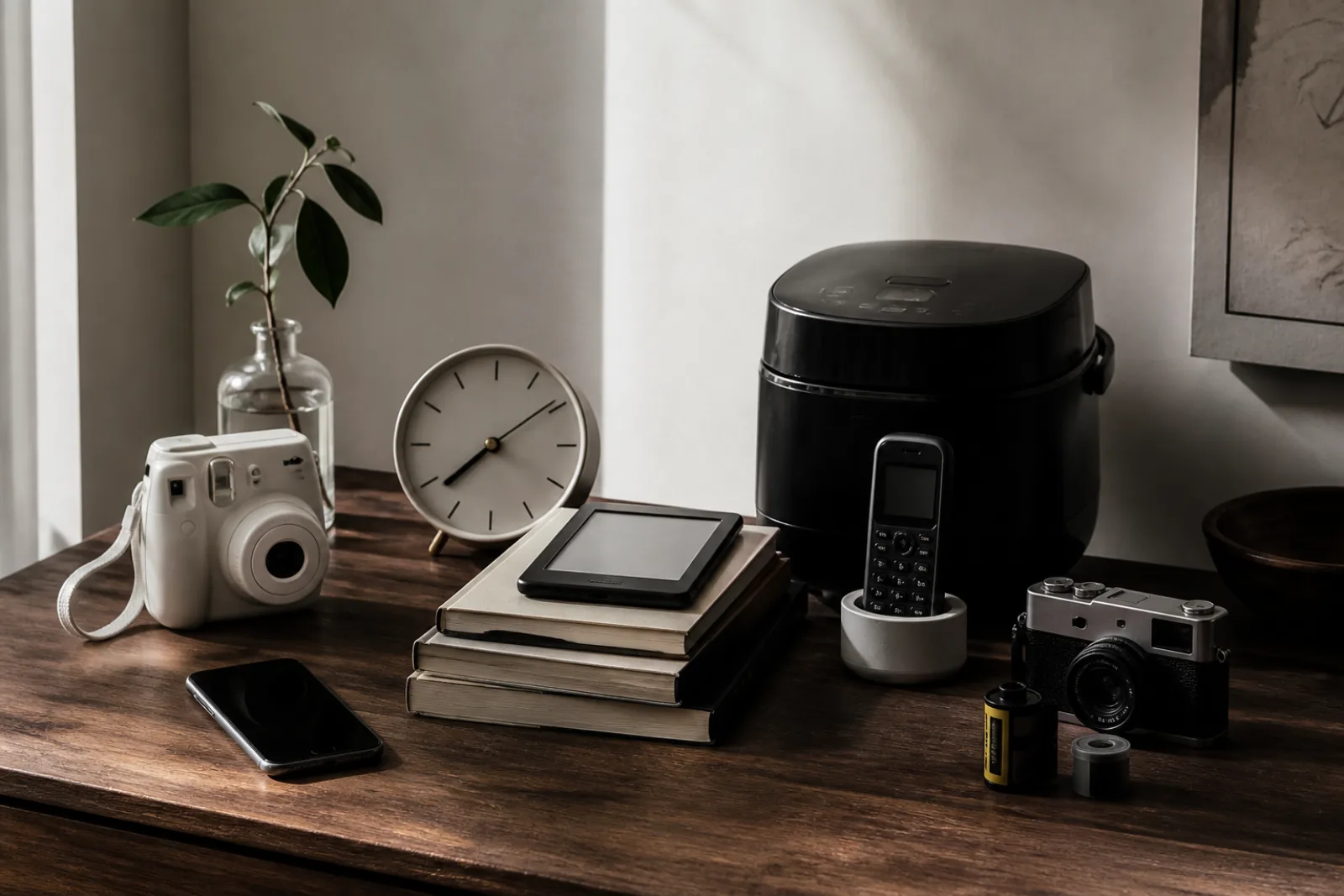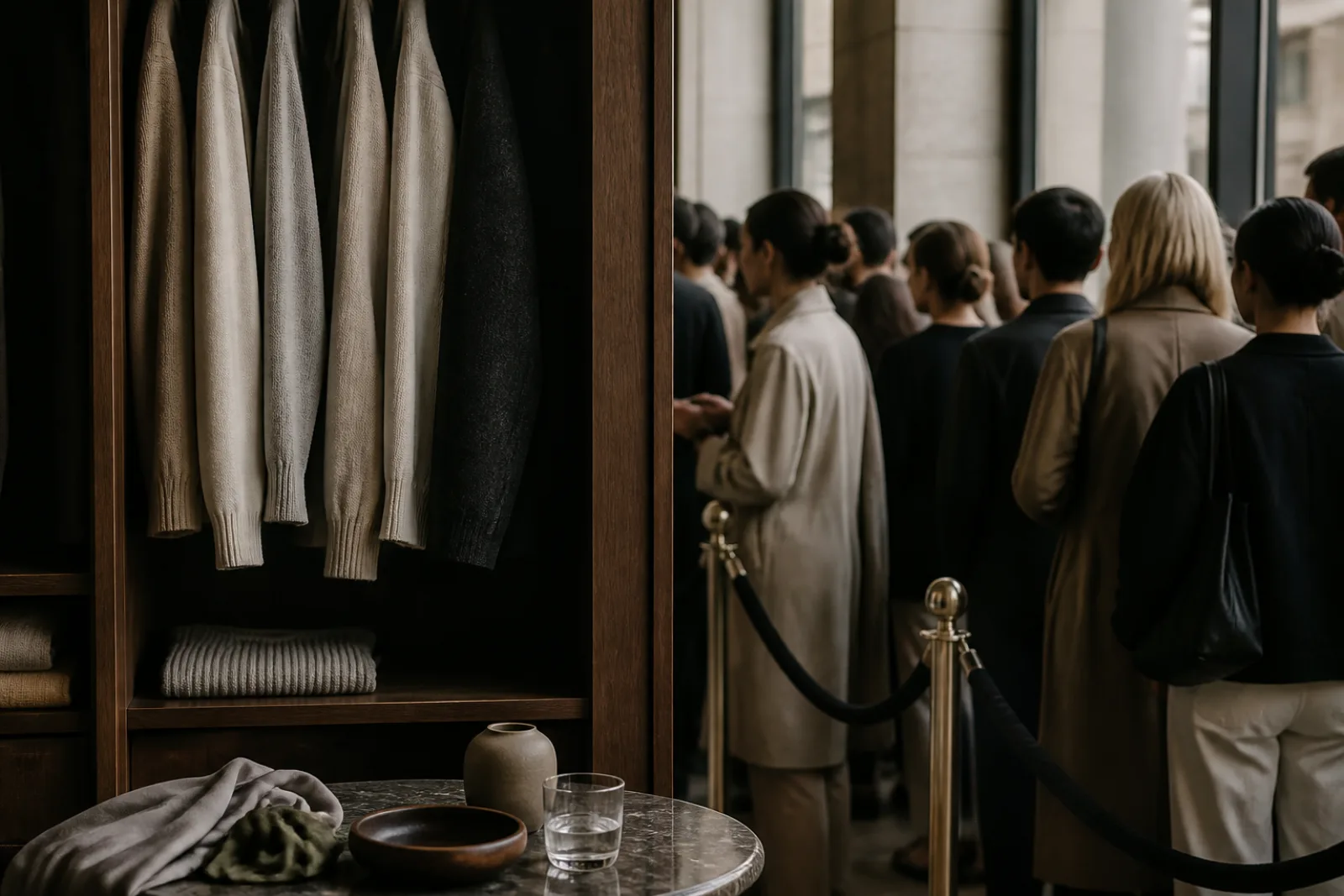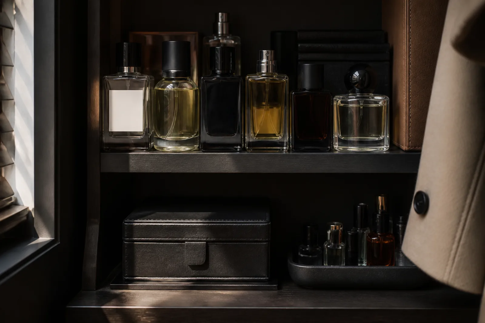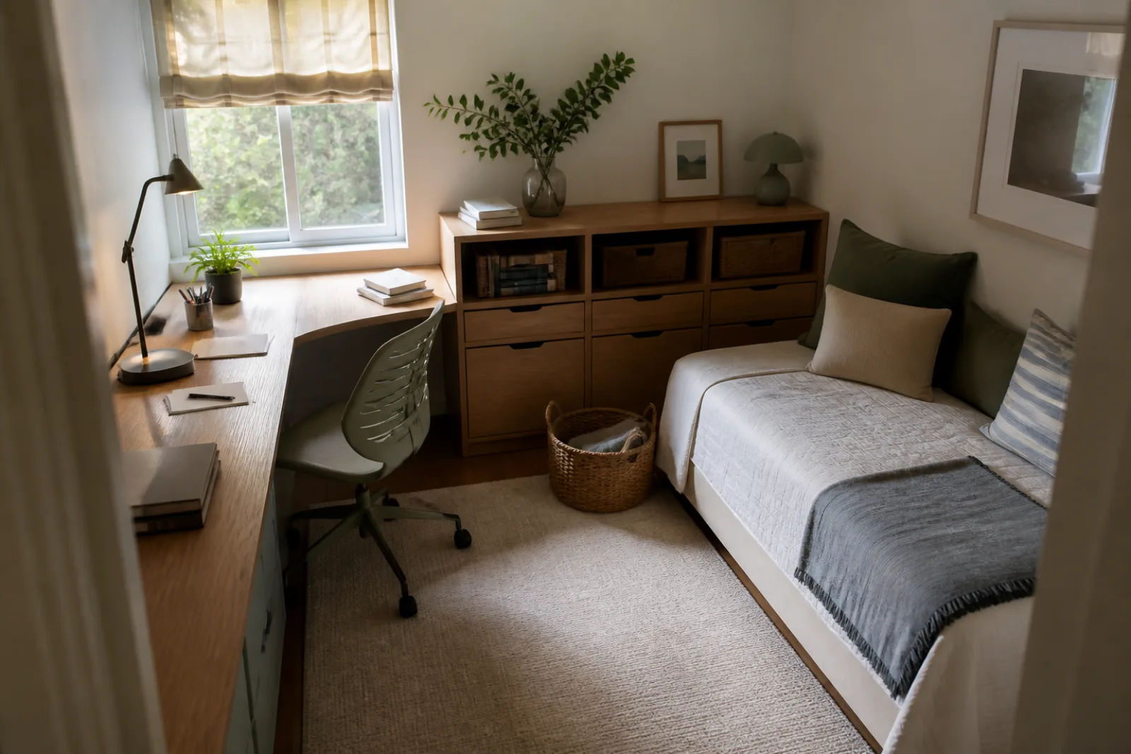
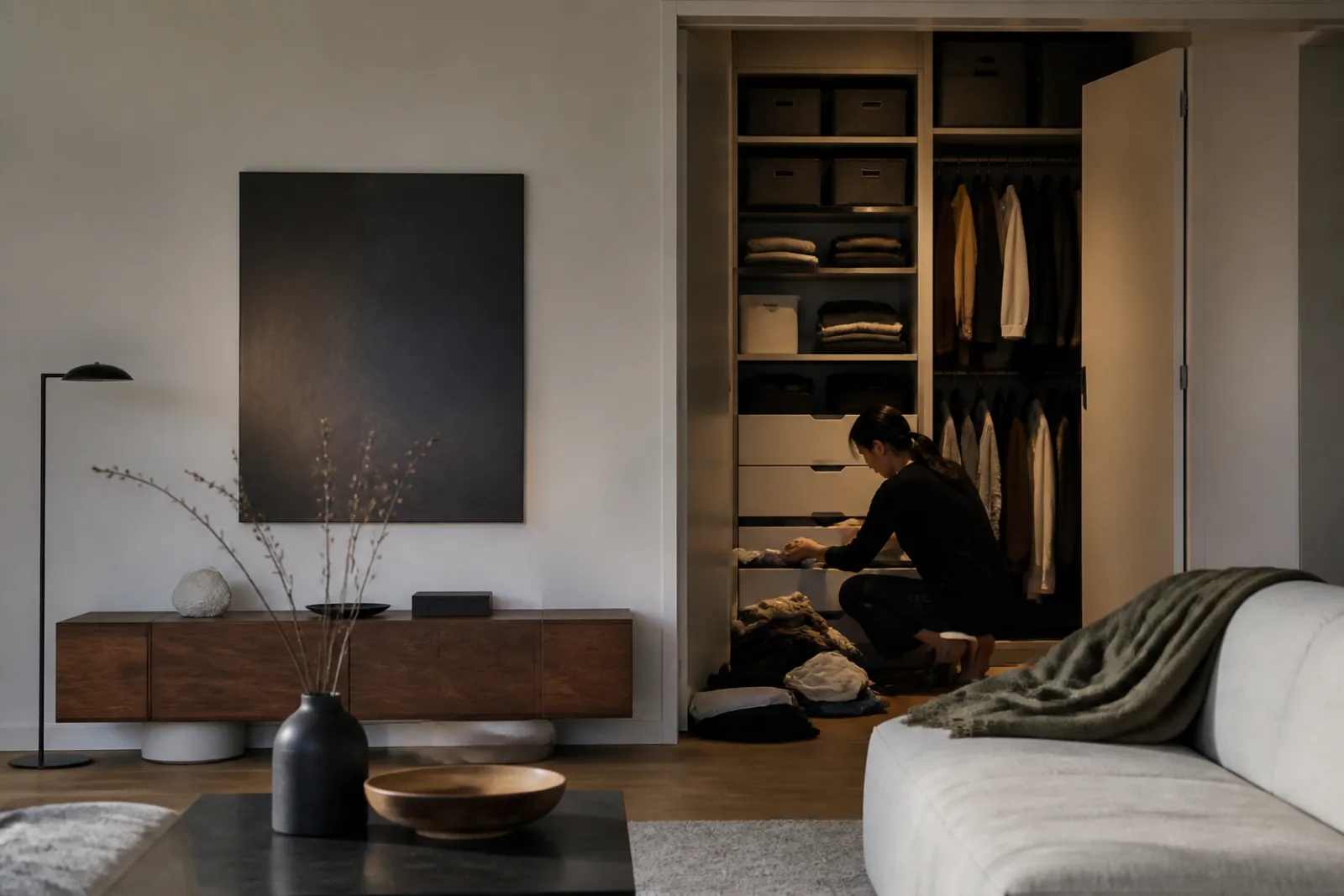
A calm room, in the catalog, has almost nothing in it. The sofa is a single color. The coffee table holds one bowl. The television, if it exists, sits inside a cabinet whose doors close. The same idea showed up on phones a decade earlier: icons without leather stitching, type without ornament, layers of translucent white. Visual calm is now something you can add to a cart. Paint. An app skin. A wall of identical doors. The copy says peace, sanctuary, clarity. The mechanism is usually hiding.
Hiding is not a sin. A closed cabinet can make a small room usable. A flatter interface can make a screen less noisy. The cultural change is that calm became a category with moral overtones, as if a gray wall were a character trait and a visible pile of mail were a failure. Architectural Digest, writing about millennial gray in 2023, noted that posts about color disappearing from homes had 'reached the tenor of a moral panic.' That panic is the tell. A palette is being asked to do ethics. Palettes are bad at ethics. They are good at concealing labor. The service being sold, under names that keep changing, modern, Scandinavian, quiet, sanctuary, wellness, is a visually low-stimulus field plus a place to put the evidence that people actually live there. Buy the field if it helps you. Do not buy the implication that the person with visible stuff has failed at being well.
What changed
Mail, toys, and cables stayed in the picture because they were the life.
Muted walls and furniture that swallow clutter last only as long as someone hides the evidence of use.
Date the software version first, because it is easier to source than a paint-chip mood. On 10 June 2013 Apple unveiled iOS 7 as, in its own words, the most significant iOS update since the original iPhone. Jony Ive, then senior vice president of Design, said there was a profound and enduring beauty in simplicity, in clarity, in efficiency, and that true simplicity was derived from more than the absence of clutter and ornamentation: it was about bringing order to complexity. The interface dropped skeuomorphic leather and green felt for flat color, thin type, and translucency. Wired called the result unobtrusive and deferential, a UI that recedes so content can rise. Nielsen Norman Group, in a 2013 appraisal, was less enchanted: flat design hides calls to action; when chrome recedes, buttons can look like text. Both readings can be true. Calm on a screen is a reduction of signifiers. Reduction can be elegant. It can also make the machine harder to operate. That tradeoff never left the category. It just moved into living rooms.
Calm as a look, in software and then in rooms
- 2013iOS 7 flattens the phone
Apple ships a redesigned interface and Ive's simplicity language. Other platforms had already been flattening. The phone in the pocket becomes a preview of the room: less metaphor, more mute color.
- 2010sGray becomes the safe interior default
Cool gray walls, gray sofas, gray-brown floors replace the Tuscan golds of the 2000s. The look is cheap to specify in rentals and flips, and it photographs as modern. It later gets a nickname: millennial gray.
- 2010s-2020sStorage as a disappearing act
IKEA PAX and BESTA, The Container Store, California Closets, and TV-as-cabinet furniture sell the closed plane. The Home Edit turns labeled bins into entertainment. Concealment becomes content.
- 2023The backlash is filmed
Architectural Digest describes Gen Z's hatred of millennial gray as a taste war. TikTok treats gray as a character flaw. The panic is about color. The product being defended or attacked is still a low-stimulus room.
- 2025Wellness language takes the same job
IKEA's 2025 trend notes sell a sanctuary and homes designed around well-being: reading corners, quiet places to unwind. The palette may warm up. The offer is still a managed visual field.
Apple Newsroom, 10 June 2013; Nielsen Norman Group, 2013; Architectural Digest, 2023; IKEA interior trend notes, 2025.
Millennial gray is the interior version of that flattened phone, with worse press. Architectural Digest's 2023 piece refused the easiest story, that only landlords and house flippers used the color, and talked to millennials who like monochrome because it feels calm, because sofas and curtains are expensive, and because gray seemed flexible. That is a material explanation. A generation that rented through a financial crisis, then bought under high prices, has reasons to choose a paint that will not fight the next tenant or the next sofa. Gen Z's dopamine-decor mockery, in the same article, is a different media object: a generation raised on overstimulating feeds performing maximalism as a personality. Neither side is a census of American living rooms. Benjamin Moore still putting grays among popular interior shades, as later shelter coverage noted, is a reminder that the nickname outran the sales floor. Treat the TikTok fight as a fight about taste content. The housing market, rental turnover, and the price of a sofa are the quieter reasons a low-stimulus default spread, and they do not care which generation is currently winning the comments.
What the nickname got right is the product. A gray, low-contrast room reduces visual claims on attention. So does a closet with sliding doors. So does an app with fewer borders. The category is bigger than a paint chip. It includes wellness-as-aesthetic: spa beige, olive 'calm,' the reading nook IKEA's Izabela Kaminska described in 2025 as part of creating 'your own little sanctuary,' homes 'designed with a focus on well-being.' Kaminska is an interior design manager for a retailer. She is not a clinician. The language still does a job. It sells quiet as care. Care, in a body, might be sleep, or a door that closes, or less unpaid tidying. Care in a catalog is a palette and a storage system.
| Surface | What you are supposed to see | What is usually concealed | Labor that preserves the look |
|---|---|---|---|
| Living room | One sofa color, a clear table, a closed media cabinet. | Toys, chargers, mail, the second laptop, the blanket that is actually used. | Nightly reset: doors shut, surfaces wiped, objects returned to bins. Often unpaid, often one person's job. |
| Kitchen | Slab fronts, hidden small appliances, a single bowl of fruit. | The toaster, the medicine, the school forms, the recycling that did not go out. | Putting appliances in cupboards after each use. A calm kitchen is a kitchen that has been restaged. |
| Closet / PAX / California Closets | A plane of doors, maybe a sliver of matching hangers. | Off-season clothes, the vacuum, the gift bags, the life that does not hang in a row. | Editing, folding, and the decision to own less, or to own the same amount behind a more expensive door. |
| Phone home screen | A few icons, a muted wallpaper, widgets as composition. | The other 80 apps, the badges, the photos, the messages. | Folders, grayscale modes, app deletion. Calm here is configuration labor, repeated after every OS update. |
The catalog photograph is a completed reset. Each quiet surface has a corresponding offstage volume and a person who moved things into it.
- 01Closed media cabinet
Conceals the router lights, the game console, the tangle of HDMI. Someone has to open it to use the equipment, then close it for the look to return.
- 02Low-contrast walls and sofa
Reduces visual noise. Also shows every stain, which is why the look is paired with performance fabric and a no-shoes rule, more rules, more enforcement.
- 03Single decorative object on the table
A bowl or a book as a prop. The remote, the mugs, and the mail have a drawer, which is full.
- 04Identical storage boxes on open shelves
Life, labeled. The Home Edit made this a television format. The boxes are not emptiness. They are opacity with better graphic design.
- 05Hidden laundry and cables
The tell. If you cannot see how the lamps are powered or where the clothes go, the photograph has edited a household system, not abolished it.
“There is a profound and enduring beauty in simplicity, in clarity, in efficiency. True simplicity is derived from so much more than just the absence of clutter and ornamentation. It's about bringing order to complexity.
Jony Ive, Apple Newsroom, 10 June 2013, on iOS 7
Ive's sentence is more honest than most sanctuary copy, because it admits the work: order, not absence. Order is a verb. Someone orders the complexity. In a phone OS, that someone is a design team, and the cost is paid in missed buttons, as Nielsen Norman Group flagged. In a home, the someone is often a specific adult, disproportionately the person already doing the household's invisible work, and the cost is paid every evening. Marie Kondo's folding, The Home Edit's rainbow pantry, California Closets' custom doors, and IKEA's BESTA sequence are different price points for the same service: make life less visible. The service can be a relief in a small apartment. It can also be a second job that the catalog attributes to the furniture.
IKEA's STOCKHOLM 2025 collection, the company said, moved away from cohesive palettes and matching pieces toward bolder combinations. That is a retailer adjusting after a quiet decade, not a population converting to maximalism. The storage wall did not get discontinued. What changes in the trend notes is the mood word, from modern gray to sanctuary, from flat white to walnut. The product category is still a managed visual field. Wellness is the current word for the same field. A reading corner is a real pleasure. A reading corner in a campaign is also a way to sell a chair, a lamp, and the implication that your nervous system will follow the floor plan.
The caveat that belongs here is the one the old template almost got right. A restrained visual system can be useful without being morally superior. Some people think better in a room with fewer claims on the eye. Some people need to see their tools. Some people are tired, and a closed door is cheaper than a personality rebuild. Gray paint did not cause a mental-health crisis, and a colorful rug will not cure one. TikTok's moral panic about millennial gray is still TikTok: a taste argument filmed as a character judgment. The useful questions are plainer. What is being concealed? How often does it have to be concealed again? Who does that? If the answers are 'the family's actual life,' 'every night,' and 'one person who is not in the photograph,' then the calm is a service with a labor cost, not a virtue you can roll on with a two-inch brush.
Wellness-as-aesthetic is the current wrapper on the same service. A spa, an Equinox locker room, a meditation app's gradient, and a rental staged in greige are all selling a nervous system a picture of itself at rest. Some of those pictures correspond to actual rest. Many correspond to a rule set: no shoes, no visible plastic, no art that is not beige, no toys after 7 p.m. The rule set is the product. IKEA can put walnut and glass in STOCKHOLM 2025 and still be in the business of order. California Closets can laser-measure a wall and sell you the feeling that your life will finally fit. The Home Edit can rainbow-order a pantry on television so that concealment looks like play. None of that is wicked. It becomes a problem when the picture is treated as proof that the household is well, or that the person who cannot keep the doors shut is failing at health rather than short on time.
Software still runs a parallel market. After iOS 7, every major interface spent a decade reducing borders, then quietly putting some of them back when people could not find the button. Focus modes, grayscale accessibility settings, and 'minimalist' home-screen layouts are the consumer DIY version of Ive's order. They are also maintenance. An OS update restores badges. A new app installs itself on the first page. Calm on a phone is a configuration you redo. Nielsen Norman Group's 2013 warning, that flat design hides calls to action, is the unromantic limit on the whole category, rooms included. If you remove enough signifiers, the space looks peaceful and becomes harder to use. A kitchen with every appliance behind a slab door is quiet in photographs and slower at breakfast. Whether that trade is worth it is a household question. It is not a virtue contest, and it is not a wellness diagnosis.
Calm is a system, not a color
- 01
Name the concealment. If the room only works with the doors shut, the product is storage plus labor, not peace.
- 02
Date the look. iOS 7 is 2013. Millennial gray is a 2010s default with a 2023 nickname. Sanctuary is 2025 catalog language for a related offer.
- 03
Let restraint be practical. A quieter screen or a closed cabinet can help. It does not make the owner more serious, healthier, or more ethical than a person with visible stuff.
Questions
- 01Is millennial gray over?
As a TikTok villain, it had a loud 2023. As a paint and sofa default, it remains easy to buy. Architectural Digest treated the fight as a taste war. IKEA's later sanctuary language warms the mood without abandoning storage systems that hide clutter.
- 02Does a calmer interface actually calm people?
It can reduce visual noise. Nielsen Norman Group's iOS 7 critique is the limit: fewer signifiers can also hide the controls you need. Calm is not the same as usable, and neither is the same as well.
- 03What should I do if I like the look but hate the upkeep?
Reduce the surfaces that only work when empty, or accept visible life on some of them. The expensive version of calm is custom millwork. The honest version is fewer objects that require a nightly performance.